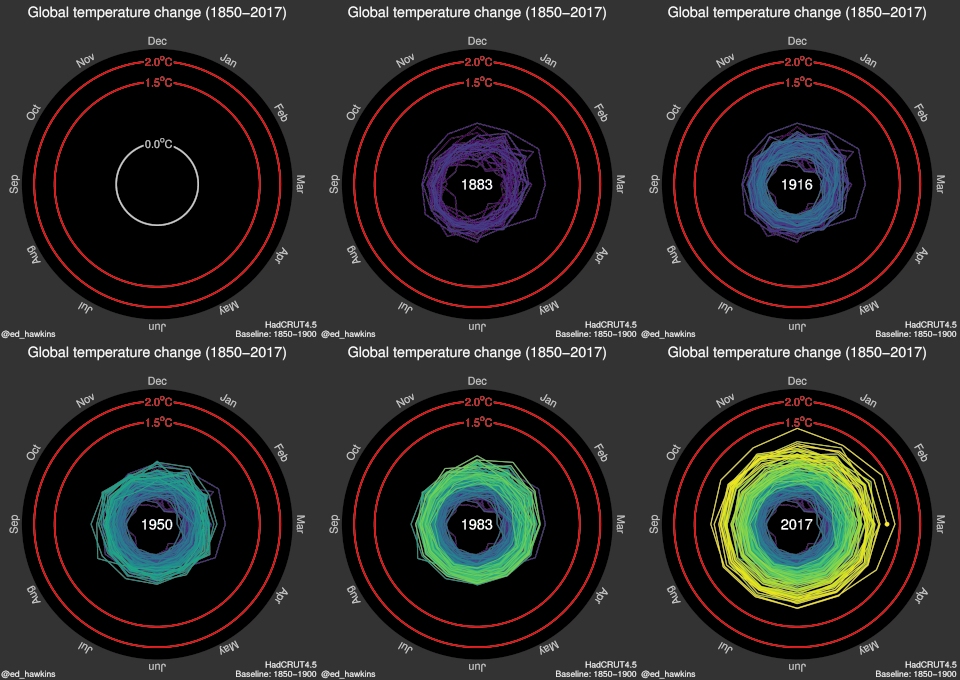
What story does this animated graphic tell about climate change? (Climate Spirals image © Ed Hawkins, License CC BY-SA International 4.0. This content is excluded from our Creative Commons license.)
Instructor(s)
Rahul Bhargava
MIT Course Number
CMS.631 / CMS.831 / MAS.784
As Taught In
Spring 2017
Level
Undergraduate / Graduate
Course Description
Course Features
Educator Features
Course Description
This course explores visualization methodologies to conceive and represent systems and data, e.g., financial, media, economic, political, etc., with a particular focus on climate change data in this version of the course. Topics include basic methods for research, cleaning, and analysis of datasets, and creative methods of data presentation and storytelling. The course considers the emotional, aesthetic, ethical, and practical effects of different presentation methods as well as how to develop metrics for assessing impact. Coursework includes readings, visualization exercises, and a final project.


